Envira Video Gallery
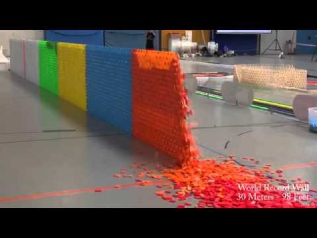
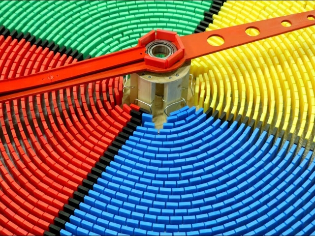
Envira is not a slider like Soliloquy is, but a gallery. Below, the "Crop Images" setting has been checked, otherwise, the sizes will be different, and it doesn't look very good. This looks great on a smart phone!
Envira Gallery (3 Columns)
This is the same as the previous, except "3 Columns" has been selected. This looks great on a smart phone!
Envira Gallery (3 Column, Title, Isotope unchecked)
Same as previous, except title appears below and Isotope feature is now unchecked. If you leave Isotope checked, the heights will be imbalanced due to the title appearing below. Leaving Isotope unchecked causes the images on succeeding rows to be perfectly aligned. This looks great on a smart phone!
Warning: For testing purposes only, the lightbox has been disabled for this gallery, on both the desktop and mobile view. They are each independently enabled, so you can enable one and not the other. Without the lightbox, the video will immediately go to full-screen mode -- which isn't bad, but doesn't provide you with as much control, forcing the user to press the "back" button to get back to the list of videos after viewing one.
Envira Video Gallery Verdict!
Envira has tons of features that we didn't mention here. You can eleminate the black bars (above) and turn them white, if you want. And there are a whole host of other settings. And when it comes to smart phone presentation, wow, Envira seems to have nailed it. This has got to be worth points. We've tried hard to look for a video gallery that presents superbly on a smart phone, and "it ain't easy"! Envira gets a 10/10 for this. The videos also render and play well on a smart phone, coming up in a lightbox that has thumbnails, so you can easily scroll through them. Super! Envira is one of our favorites for these reasons. Who can complain?


